Data Representation refers to the form in which data is stored, processed,
and transmitted.
Dashboard Creation
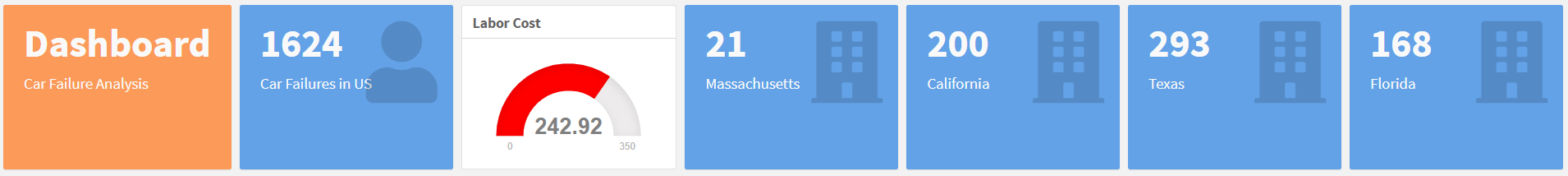
VALUE BOXES
ValueBoxes are used to show the data in larger text like titles so we have
placed in the main body of dashboard, we have shown “car failures in US and
various states” , “Labor Cost” , Etc by using valueBox.
INITIALIZING THE FIRST PAGE
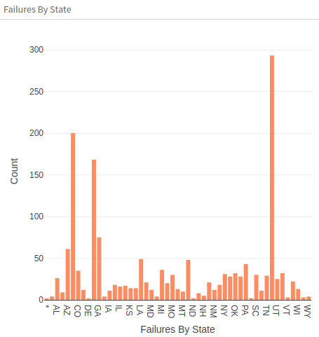
- A new Row which consists the interactive bar plot of Failures By State
created using plot_ly
-
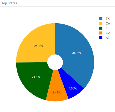
A pie chart to indicate Top states
Here we are only including the states which have failures more than 50
-
An interactive bar plot of Failure month vs Failure mileage
-
An interactive Scatter plot of Month Vs Mileage
-
A Box Plot of Top State for labor costs using ggvis
-
ggvis graphs are HTML, they can be used in a shiny web application, R
markdown reports, it is easy to build interactive graphics for exploratory
data analysis using ggvis
INITIALIZING SECOND AND THIRD PAGES
-
Map visualization
- Extracting the data of number of car failures according to their state
- Interactive data table
- This Table provides multiple ways to narrow down the specific data
1.CREATING VALUE BOXES
Interactive Data Visualization
=====================================
Row
-------------------------------------
### Car Failure Analysis
```{r}
valueBox(paste("Failure"),
color = "warning")
```
### Car Failures in US
```{r}
valueBox(length(data$State),
icon = "fa-user")
```
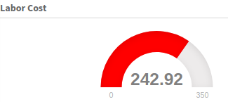
### **Labor Cost**
```{r}
gauge(round(mean(data$lc),
digits = 2),
min = 0,
max = 350,
gaugeSectors(success = c(0, 150),
warning = c(150, 240),
danger = c(240, 350),
colors = c("green","yellow","red")))
```
### Massachusetts
```{r}
valueBox(sum(data$State == "MA"),
icon = 'fa-building')
```
### California
```{r}
valueBox(sum(data$State == "CA"),
icon = 'fa-building')
```
### Texas
```{r}
valueBox(sum(data$State == "TX"),
icon = 'fa-building')
```
### Florida
```{r}
valueBox(sum(data$State == "FL"),
icon = 'fa-building')
```
                            2.BAR PLOT FOR FAILURES OF EACH STATE

Row
-------------------------------

### Failures By State

```{r}
p1 <- data %>%
         group_by(State) %>%
         summarise(count = n()) %>%
         plot_ly(x = ~State,
                 y = ~count,
                 color = "blue",
                 type = 'bar') %>%
layout(xaxis = list(title = "Failures By State"),
yaxis = list(title = 'Count'))
p1
```
                            3.PIE CHART FOR FAILURE VS MILEAGE

### Top States

```{r}
p2 <- data %>%
         group_by(State) %>%
         summarise(count = n()) %>%
         filter(count>50) %>%
         plot_ly(labels = ~State,
                 values = ~count,
                 marker = list(colors = mycolors)) %>%
         add_pie(hole = 0.2) %>%
         layout(xaxis = list(zeroline = F,
                             showline = F,
                             showticklabels = F,
                             showgrid = F),
                yaxis = list(zeroline = F,
                             showline = F,
                             showticklabels=F,
                             showgrid=F))
p2
```
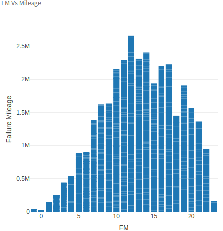
                    4.BAR PLOT FOR MILEAGE VS FAILURE MILEAGE

### FM Vs Mileage

```{r}
p3 <- plot_ly(data, x=~fm, y=~Mileage, text=paste("FM:", data$fm, "Mileage:" , data$Mileage),
    type="bar" ) %>%
    layout(xaxis = list(title="FM"),
    yaxis = list(title = "Failure Mileage"))
p3
```
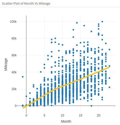
                            5.SCATTER PLOT FOR MONTHS VS MILEAGE


Row
------------------------------------
### Scatter Plot of Month Vs Mileage

```{r}
p4 <- plot_ly(data, x=~fm) %>%
         add_markers(y = ~Mileage,
                     text = ~paste("Mileage: ", Mileage),
                     showlegend = F) %>%
         add_lines(y = ~fitted(loess(Mileage ~ fm)),
                   name = "Loess Smoother",
                   color = I("#FFC125"),
                   showlegend = T,
                   line = list(width=5)) %>%
         layout(xaxis = list(title = "Month"),
                yaxis = list(title = "Mileage"))
p4
```
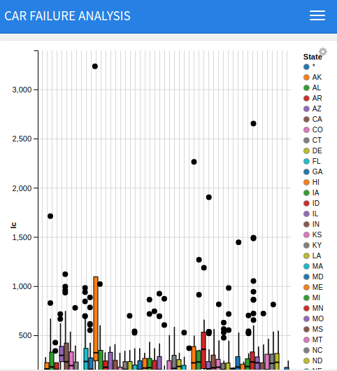
                            6.LABOUR COSTS IN EACH STATE

Labor costs
=====================================


```{r}
data %>%
         group_by(State) %>%
         ggvis(~State, ~lc, fill = ~State) %>%
         layer_boxplots()
```
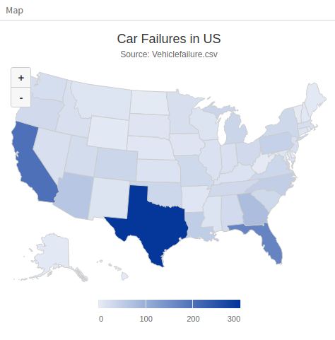
                            7.COLOR MAP WHICH SHOWS STATE-WISE FALIURES

Map
========================================

### Map

```{r}
car <- data %>%
         group_by(State) %>%
         summarize(total = n())
car$State <- abbr2state(car$State)

highchart() %>%
         hc_title(text = "Car Failures in US") %>%
         hc_subtitle(text = "Source: Vehiclefailure.csv") %>%
         hc_add_series_map(usgeojson, car,
                           name = "State",
                           value = "total",
                           joinBy = c("woename", "State")) %>%
         hc_mapNavigation(enabled = T)
```
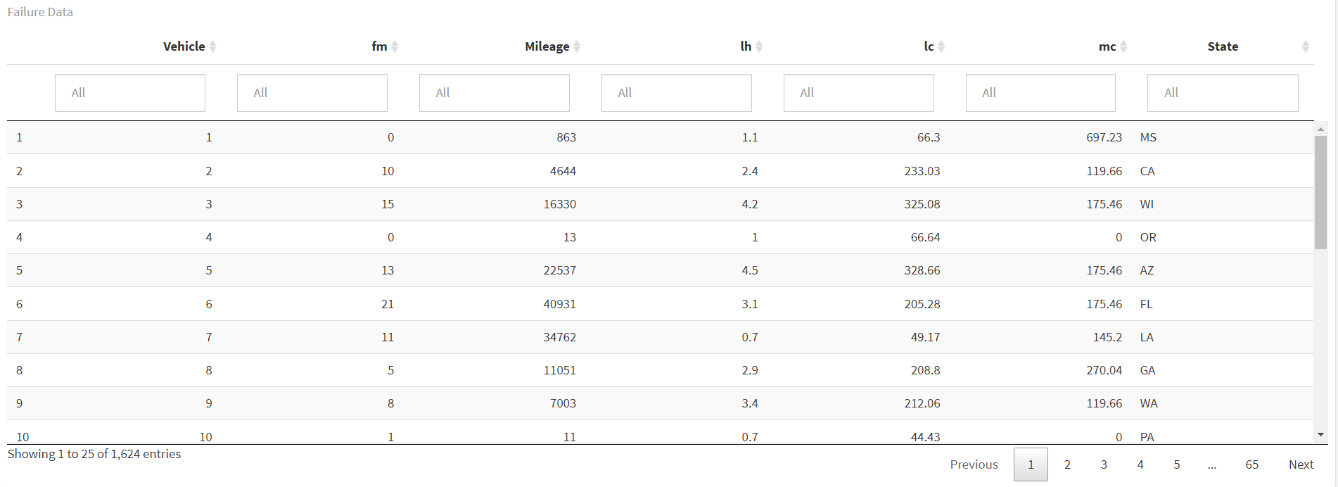
                            8.DATA TABLE

Data Table
========================================

```{r}
datatable(data,
          caption = "Failure Data",
          rownames = T,
          filter = "top",
          options = list(pageLength = 25))
```
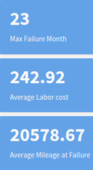
RESULT ANALYSIS
Summary Report {data-oriuentation = columns}
===========================================

Column {data-width = 100}
-----------------------------------

### Max Failures In Month

    ```{r}
valueBox(max(data$fm),
         icon = "fa-user" )
```

### Average Labor cost
```{r}
valueBox(round(mean(data$lc),
               digits = 2),
         icon = "fa-area-chart")
```

### Average Mileage at Failure

```{r}
valueBox(round(mean(data$Mileage), digits = 2),
         icon = "fa-area-chart")
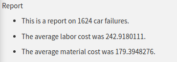
1.This is a report on `r length(data$fm)` car failures.
// length captures the amount of failures

2.The average labor cost was `r mean(data$lc)`.
// average labor cost

3.The average material cost was `r mean(data$mc)`.
// average material cost

.gif)


Comments
Name
Comment
Name
Comment
Name
Comment